The Role of Colour in Wellbeing
Every year colour experts Pantone release a Pantone Colour of the Year. This year is Living Coral, “Living Coral embraces us with warmth and nourishment to provide comfort and buoyancy in our continually shifting environment.” With this year’s colour being heavily influenced by the environment it is no wonder designers are focusing on nature, sustainability and creating spaces that influence our wellbeing. Here are some eco friendly ways to use colour to influence our wellbeing through colour psychology in interior design.
“Colour psychology is the study of hues as a determinant of human behaviour. Colour influences perceptions that are not obvious, such as the taste of food.”
Different colours can trigger different emotions. Like warm red shades for some can trigger emotions around anger or increase stress levels. While lighter, cooler blue green colours, can calm people down.
INTRODUCING COLOUR THROUGH…
PANTONE’S LIVING CORAL IN ACTION
Here we see how designers are embracing the Pantone Colour of the Year to influence the wellbeing of people in these spaces.
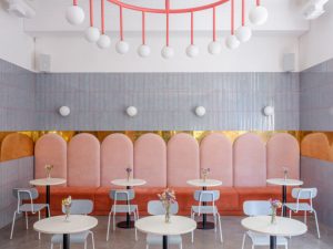
Photo from: design-milk.com
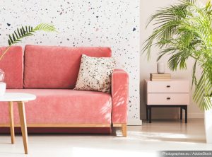
Photo from: amara.com
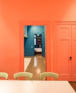
Photo from: dezeen.com
NATURAL MATERIALS
Using natural materials within a space is a great way to bring a ‘calm’ feel. Being both environmentally friendly and great for your wellbeing, it’s a very popular pick in the interiors world at the moment. From reducing stress to enhancing learning in the early years of development, the benefits of incorporating natural materials into interiors are real. It is believed that bringing natural materials into a classroom environment is an important part of a child’s language development, socialisation skills and cognitive and sensory learning. Here are a few examples of natural materials both in hue and in texture setting the mood.
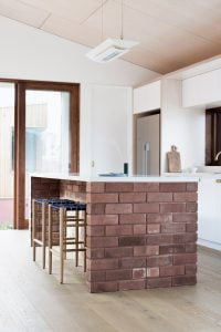
Photo From: yellowtrace.com

Photo From: homebeautiful.com
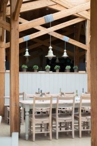
Photo From: simshilditch.com
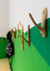
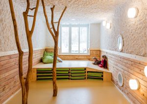
Photo’s From: baukind.de
PLANTS AND GREENERY
Now we know plants and greenery would technically come under ‘Natural Materials’ but plants are such an important and beautiful addition to any interior that they deserve their own section. Plus they often have a stronger presence because of the vibrancy of the green colour. As well as adding visual benefits, plants add many physiological benefits to us; they help reduce stress and create a calm sense of wellbeing, alongside improving air quality and lowering background noise, which make them a very popular option in an office environment. They also prove to be greatly beneficial within hospitals and medical practices. From purifying air toxins and improving ventilation to even speeding up recovery time.
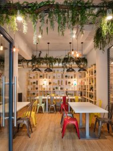
Photo From: officesnapshots.com
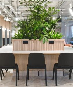
Photo From: @theofficegroup
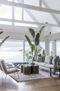
Photo From: cocorepublic.com.au
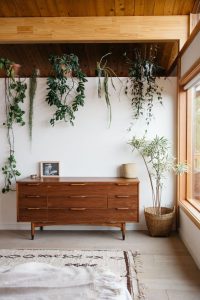
Photo From: sfgirlbybay.com
ECO-FRIENDLY PAINT
While we are talking about influencing space with colour we should talk about the process. Painting a wall, door or piece of furniture within any space seems the most obvious and quick way to introduce colour into an interior. However choosing a paint that isn’t full of toxins and chemicals is very important when focusing on sustainability. Some paints contain ‘Volatile Organic Compounds’ (VOCs) which are low level toxic emissions that can cause symptoms like, dizziness, headaches and in some cases even memory loss. More and more paint companies are now producing low toxin paints and even paints 100% free of VOCs. Check out earthfirst.net.au for a list of some Eco-friendly paint suppliers.
LIGHTING
There are many ‘green’ ways to light an interior these days, from more environmentally friendly LED and CFL bulbs, to solar lighting and motion sensors which reduce power use. However, what we are really focusing on here is how to bring colour into an interior. It’s a lot easier to do this now there are companies like Philips that have their Hue range. It is a bonus that you can control your lights with your phone or your voice, but the biggest shift is we can now change the colour to suit the desired mood. There is so much lighting can do with lighting to benefit your wellbeing and now with coloured lighting there is another dimension for designers to play with. Green, blue and purple are believed to restart your internal clock and increase productivity. Energetic colours like warm orange and yellows can calm you down, help you relax and lift your mood.
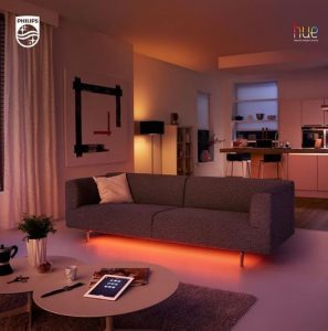
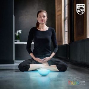
Photos From: @phillipshue
ACCENT COLOUR
With the rise of individuality and the revival of artisan techniques in design trends, we are seeing stronger use of colour and pattern through feature pieces. The mood and colours of a room are dictated by these feature pieces which can be subtle or bold like Dolce and Gabbana’s design for Smeg, which is based on an Italian painting technique used to paint puppets.

Photo from: mikeshouts.com
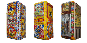
Photo from: smeg.com
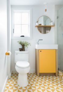
Photo from: domino.com
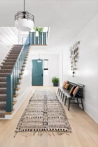
Photo from: cocokelley.com
As you can see, colour is so much more than paint on walls. From subtle use in materials to accent pieces, the way we engage with colour in line with the overarching trend of eco-friendly design and wellbeing is here to stay.
ISCD has a 40-year proven track record of producing leading Australian interior designers. We know design intimately, from colour theory, to furniture selection to the latest industry trends.
Are you interested in studying interior design or decoration? Do you want to know more about our online courses and where a career in interior design could take you? Connect with us today to learn more about our Diploma of Interior Design, the Certificate IV in Interior Decoration or any of our industry-focused microcredentials.